3 Tips to Get More Website Leads in 2016


The New Year is synonymous with one thing: resolutions. And in the world of business, one top resolution is to make sure your website is as engaging and user friendly as it can be. When your website engages clients and potential clients, you are already ahead of the game when it comes to Internet marketing. If you’re not there yet, you should be. The following tips will help you launch your business in 2016 ahead of the competition and right into the mind of customers. And, your website will be set up to keep users coming back and respond to that all-important call to action.
Let’s assume you already have a website. Your website promotes your business, lists your services, details the history of your business, etc. You think your website is pretty good. After all, you paid a web developer big bucks to put it together for you (or your sister-in-law did it for free).
The question now becomes, is your website engaging? Is it converting for you? In other words, do the people who visit your website (a.k.a. web traffic) go a step further and call or otherwise contact you (a.k.a. convert)? You need something lucrative out of your site visits, not just window shoppers. What good is all that traffic if no one is hiring you?
Consider the following three ways to engage visitors to your site, improve conversions, and increase call volume.
1. Responsive Design
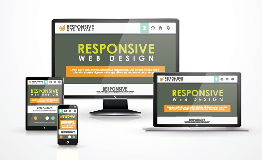
Implementing a responsive website design is key. Responsive website design means your website has optimum viewing regardless of the device or platform used for viewing. If users are on a personal computer or laptop, an iPad or tablet, or a mobile phone, the website will retain its full-screen look, view, and readability. This means your site needs to adapt to different screen sizes and look equally professional on both a 23-inch computer screen and 5-inch phone screen.
Most people want—and need—an immediate response when it comes to searching for a business on the Internet. If they don’t see what they’re looking for right away (no scrolling!), they will move on. Did you know poor website design can cost you 50 to 60 percent of your traffic? This is why you need a user-friendly design that looks good, works well, and responds perfectly, regardless of how it’s being viewed.
2. Mobile Design with One-Touch Call Buttons
Today, more people conduct searches for businesses and information on mobile devices than on desktop and laptop computers. People want answers right away, and will look for the information they need on the go. To secure some of that market, you will want to consider having a separate mobile website that launches automatically when a user accesses your site from a smartphone. And, to make your mobile website even more engaging and user friendly, you will want it to incorporate prominently-displayed one-touch call buttons. This way, when visitors to your site see your headline and call-to-action, they simply tap the one-touch call button to call you directly. No more wasted time entering your telephone number into a cell phone keypad (or misdials). One-touch calls mean you’re assured of hearing from only those prospects who are truly interested in your services.
3. Add Instant Credibility
Highly visible and informative images on a website make an impression and add credibility to your business. Visitors to your site remember these visuals and are more likely to remain on your site and follow through on a call to action. With the quality of today’s digital photography, there is no reason why every website should not have attractive, eye-catching images. When I say attractive, I don’t necessarily mean pretty. A visitor to your site could be researching the topic of cleaning up from flood water damage, and when they see before and after images of a flooded basement that is completely dry and restored, they have a clear visual of how your business operates and will be attracted to you as a business and more likely to call.
Other images that add credibility include logos to professional organizations you belong to, credit cards you accept, awards you’ve won, and more. There’s no limit and these logos are familiar to your customers and will put them at ease when it comes to taking action and spending their money. Images done right all but guarantee an improved conversion rate.
Generating conversions is the #1 one tactic you should be focusing on to help your online business grow. The three steps discussed here all serve to make your website more engaging, more attractive to visitors, and to ultimately improve your call volume.
Looking for a reprint of this article?
From high-res PDFs to custom plaques, order your copy today!


